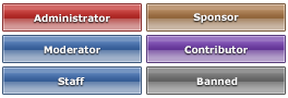
This rank set is nice but I think the change of shade in the middle is a little to much. Maybe if the bottom shade was closer to the shade of the top it would be better. Still, a great rank set none the less.
I have to agree with Grimm here, the change in shade is a bit strong. Maybe making the shift a bit more subtle would balance out these? A part from that, I like them. Simple and effective.
I really like this rank set, Gray. The colors work well together, though, I’d be interested to see the solid line centered and the text resting upon it. I can’t really say if it would look any better, but in my head I think it would. The idea isn’t bad at all, I just think it could use a bit more work 😛 Overall, it’s a great set!

5 Responses
I like this rank set. 🙂
<3
This rank set is nice but I think the change of shade in the middle is a little to much. Maybe if the bottom shade was closer to the shade of the top it would be better. Still, a great rank set none the less.
I have to agree with Grimm here, the change in shade is a bit strong. Maybe making the shift a bit more subtle would balance out these? A part from that, I like them. Simple and effective.
I really like this rank set, Gray. The colors work well together, though, I’d be interested to see the solid line centered and the text resting upon it. I can’t really say if it would look any better, but in my head I think it would. The idea isn’t bad at all, I just think it could use a bit more work 😛 Overall, it’s a great set!