Absolutely free forum rank sets!
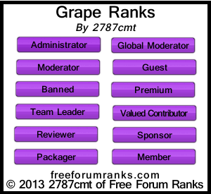
Again, a pretty nice design, I love the rounded corners. In my opinion it would of looked much better with white text instead of black, but that is just me. I just feel that purple and black are a bit too dark to be together, don’t you think?
Why are always the ranks related to promotion forums? They look nice anyways
We will be creating niche-related ranks very soon. 🙂
Your email address will not be published. Required fields are marked *
Comment *
Name *
Email *
Website
Save my name, email, and website in this browser for the next time I comment.

3 Responses
Again, a pretty nice design, I love the rounded corners. In my opinion it would of looked much better with white text instead of black, but that is just me. I just feel that purple and black are a bit too dark to be together, don’t you think?
Why are always the ranks related to promotion forums?
They look nice anyways
We will be creating niche-related ranks very soon. 🙂